Designing Create Wherever
I’ve spent a good portion of the past two days designing the logo for Create Wherever. It’s been an interesting process.
Quite a few months ago, I saw a discount on Tailor Brands’ logo design package. Since I was studying visual design, I didn’t think I’d use their service, but I ran a few business names through it for fun. One of the ideas it gave me was for a calligraphy font paired with an all-caps serif. I liked the idea and the contrast. I didn’t like the exact fonts they chose, and there was no way to change them. I also didn’t like the idea of having basically the same logo with different words that who knows how many other people chose.
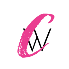
But since then, I’ve kept an eye out for a brush script font that would look good with the word, “Create”. After I started the logo design module of the Design Course, I knew it was time to finally design a logo for Create Wherever. I pulled up all my Creative Market fonts and installed a few. One immediately stood out as a good candidate, but I thought the “C” was a bit too narrow.
The next part of the process was seeing if I could find a good font to match for “Wherever”. I tried a couple serif fonts, but didn’t like how they went with the brush font. So I turned to sans serif fonts. I really wanted the “W” to have a bit of uniqueness since I wanted to use it in the favicon, but most were super plain.
Two days ago, I decided to buy a huge font bundle that DealJumbo was offering. It had a large number of gorgeous fonts, and I knew if my current font didn’t end up working, one of these would be a great fit for this site. It would also be awesome to have so many font options for future design projects.
I didn’t end up using one of those fonts, but I did find a great glyph within the bundle to add an extra swoosh to my horizontal logo. It matched the font perfectly.
I narrowed my sans serif font options down to two choices. One had more of a playful vibe, but there was not enough contrast with the brush font. The other was more sleek and sophisticated, and even though I liked it less, it was the better match.
Now I’m working to have the rest of this site match the new logo. So be prepared for a few changes ahead, and let me know what you think of the new look!

Want to hire me as a Pinterest Designer and Manager to help you get more traffic, leads, and income for your blog or business? Check out this page to see what I can do to help you grow!


Recent Comments